AICE Media Studies
Critical Reflection Presentations
4/19/2021
Prezi was used for all creative presentations
Question 1:
https://prezi.com/view/t3SsOLKl3Dr8lQMpghUG/
Question 2:
https://prezi.com/view/rfACaX1Ta6umHDx8GXL1/
Question 3:
https://prezi.com/view/onAeXedRrRGx338Kcq01/
Question 4:
https://prezi.com/view/AU5Sx1blnBkuxAm9dUSu/
Question 1:
https://prezi.com/view/t3SsOLKl3Dr8lQMpghUG/
Question 2:
https://prezi.com/view/rfACaX1Ta6umHDx8GXL1/
Question 3:
https://prezi.com/view/onAeXedRrRGx338Kcq01/
Question 4:
https://prezi.com/view/AU5Sx1blnBkuxAm9dUSu/
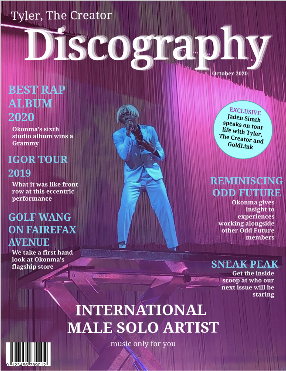
Completed Magazine Cover
4/19/2021
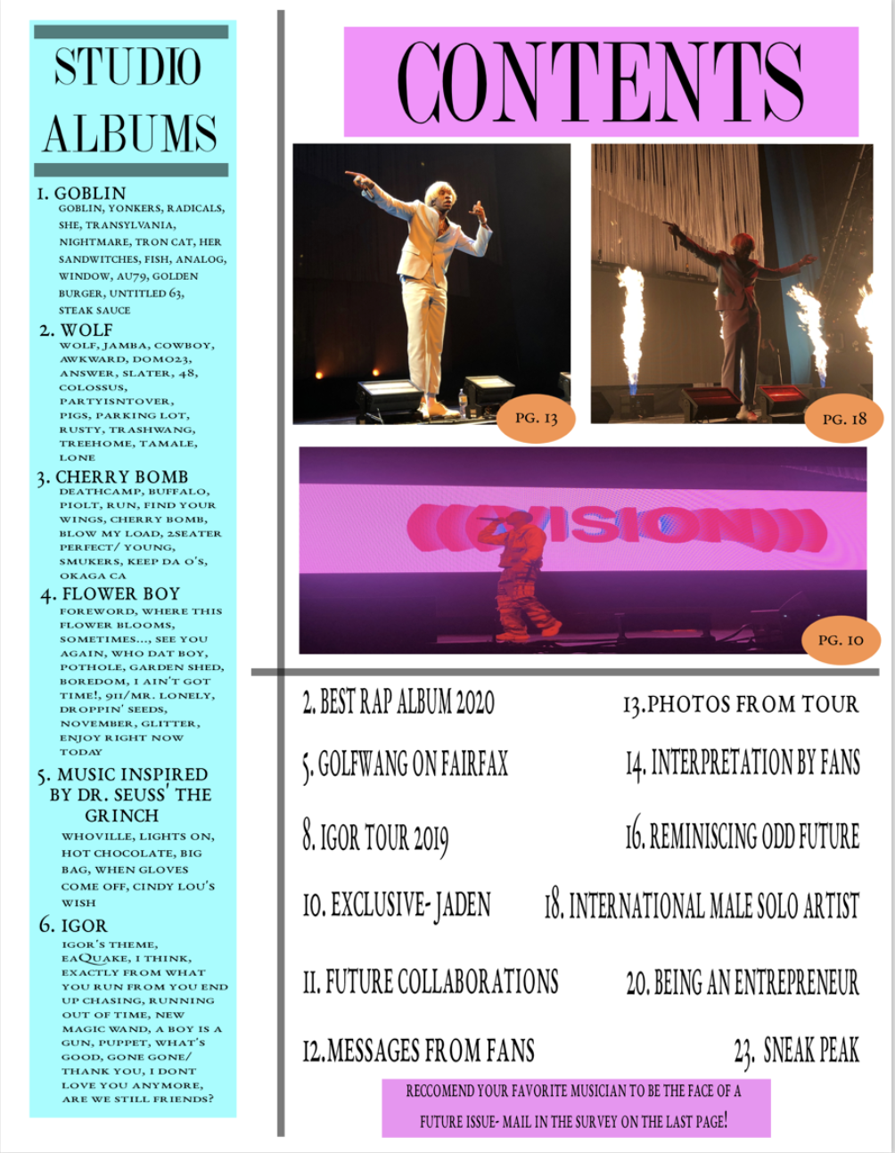
Completed Table of Contents
4/19/2021
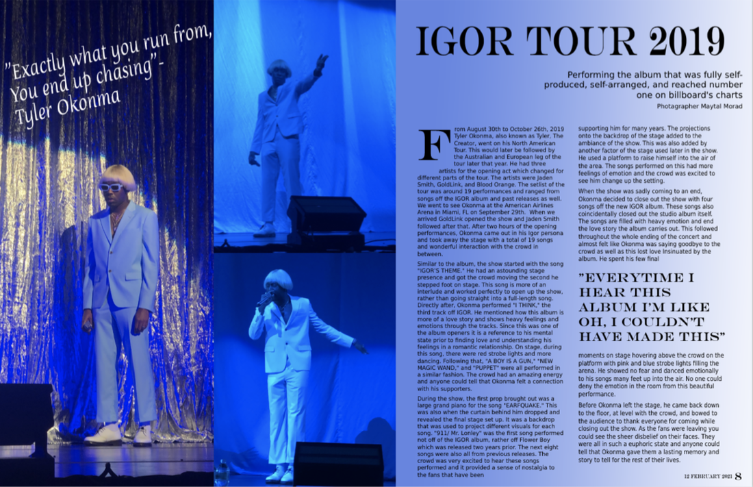
Completed Double Page Spread
4/19/2021
Critical Reflection: Q 1 (final answer)
4/9/2021
1. How does your product use or challenge conventions and how does it represent social groups or issues?
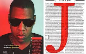
My product is a magazine that specifically surrounds music and the discography of a wide range of music artists. I used only a handful of magazines for inspiration and made each page without a template. For this reason, I believe I was able to step out of the ordinary and create something that hasn’t been seen very often in the magazine industry. Due to this, there were also no restrictions in place when deciding my layouts. The masthead on my cover page is the most unconventional because of the fading of the title. Also, most models on magazine covers have strong eye contact, while mine is in a live concert performing in an unprofessional setting. Also, on the table of contents, rather than there only being the article names, I included all the studio albums of the featured artist: Tyler, The Creator. This is done for every featured artist as the magazine is used to highlight any of their music creations through their total discography. Magazines tend to have a wide variety of genres, although there aren’t many ones that cover music as most of this information is presented digitally through other mediums. This is how the magazine we created can become a collector’s piece since fans of the artists would prefer the physical copy.
As well as being unconventional, my magazine is inclusive and represents social groups and other issues. When creating each issue of the magazine, we cover anywhere from well-known to up-and-coming artists. We collaborate with them to curate the magazine of their dreams in our template. They are given lots of creative freedom and are encouraged to include some of their own articles as well. These articles are typically included towards the end of the magazine and the artist is able to promote whatever causes or social issues they stand by or want to bring awareness to. Also, in each issue, there are hot topics that are briefly discussed on certain pages. We have no restrictions or limitations on what music artists can be featured for our issues which is why there is such diversity in our magazines themselves.
Critical Reflection: Q 2 (final answer)
4/9/2021
2. How does your product engage with audiences and how would it be distributed as a real media text?
My magazine engages with audiences in many ways because it’s made in collaboration with the artist for their supporters and other potential consumers. There is no specific age group we are targeting as the featured artist could have an audience of any age group. This gives the artist a chance to engage with their specific audience more directly as the consumer is getting a detailed look at the artist's thought processes behind their music. Also, the majority of magazine companies have a focus on pop culture, while this one specifically targets the music industry which isn’t seen very often. For this reason, I named the magazine “Discography” because it surrounds the artists and their music. Also, since the artists are given creative freedom to create their own articles, they typically find ways to have exclusive opportunities to engage with their audience directly through the magazine.
Distribution is the way I would get my product, the magazine, out to our audiences. As a real media text, my product is to be distributed both through print and digital media. Traditionally, magazines are mostly distributed through print, although as we move further into the great age of technology, it is vital to have digital options available as well. This digital option will be in the form of a document identical to the original print versions. They can be bought online through the website directly or by other second-hand vendors. The print versions of the magazines will be able to be found in local book and grocery stores. Even though it is more difficult to sell anything through print in our digital age, it is important to have this option for consumers that want to have a physical copy or even collect various issues of the magazine.
Critical Reflection: Q 3 (final answer)
4/9/2021
3. How did your production skills develop throughout this project?
Through the process of creating my magazine, my skills in Photoshop and creativity increased immensely. Since we had creative freedom on the topic of our magazines, I was able to pick something that I am passionate about and that makes me happy. That positive energy was then being translated into working harder to understand Photoshop programs and other helpful websites to create the magazine. Prior to this project, I was very familiar with the program InDesign which is fairly similar to Photoshop and other software such as Photopea. However, working more frequently with these new programs helped me increase my knowledge of different tools and features I could use. Although I wasn’t familiar with some other production websites such as Canva, my skills developed and I am now sufficient with working with those resources as well.
Other skills that I have improved on through is product was my time management and doing things myself. As I was the only one working on this project, it was up to me to delegate tasks and space out the work so I wouldn’t become overwhelmed. Also, through writing the article in the two-page spread, my writing technique has improved because I had to describe the concert with tons of imagery. It helped me learn to make sure my audience was being fulfilled by what they were reading. If the article wouldn’t have been descriptive or exciting to read, the audience would’ve been let down and the image of the brand would worsen as well. As the two-page spread was written from the perspective of my own experience, I had to research other key facts and quotes to ensure it sounded more professional. Through this, I’ve learned to take my time and research to better my writing.
Critical Reflection: Q 4 (final answer)
4/9/2021
4. How did you integrate technologies – software, hardware and online – in this project?
In the creation of my magazine, many technologies were integrated. As a single piece of technology would not have been able to be enough to create my magazine, hardware, software, and online resources were used together to create the final product. The production first began with the hardware of my iPhone X which was used to take the photos at the concert. These photos were then transferred onto my MacBook Pro in order to be added to the layouts I created. I also have a monitor that connects to my computer to create a second screen to work on layouts. This was helpful because I could work on the layout on one screen and have my inspiration on the other.
On this hardware, I used the software Photopea to fully create my magazine. From the layout to the final product, all of my work was done on Photopea. I also used Microsoft Word to type up any written portion rather than directly writing into Photopea. Online technologies that were used to create my magazine included writing apps such as Grammarly in order to spell check. As well as using websites to do further research on the topic of my magazine: Tyler, The Creator. This helped to create a well-written article for my two-page spread.
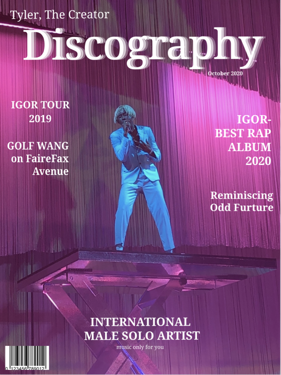
Last Magazine Cover Adjustments
4/2/2021

|
|
The left is my first revision after the first draft and the right is my final product. My revision from the first draft to the final product was the most drastic out of all of them. This is because the whole beginning part of my creative process I was fixated on having a minimalist theme, although I couldn’t figure out a way to do it so that it was executed well. Due to this, I decided to go the more traditional route and add more onto the cover to make it interesting and eye-catching. The first biggest change I made was making the cover lines a different color. I chose a blue that was very similar to the costume of the model in the cover image. I did this to create a color palette and make everything look tied together. I then made the description underneath the cover lines be white so that the letters didn’t look too messy and so that it was easy on the eye to differentiate the title from the description of the article. This differentiation was also achieved by creating an indentation with the description and the cover lines main article name. Next, I added the sticker on the right to make there be an exciting and eye-catching moment on the cover for the audience to be excited about. I did this by making a circle shape and then adding in my text and turning it a little bit to the right in order to make it at an angle. By having to text at an angle it helps make the note stick out and be the real attention grabber. This was also achieved by making the color of the circle a lighter shade of blue than the one of the cover lines, although by having the stroke of the outside of the circle still be that same blue shade, it all gets tied back together. I’ve then slightly adjusted the different layers for the masthead where it says “Discography” in order to make it more clean and look more like a fade. The strap line and other small parts were not adjusted in this revision as I finished that part in the last revision and I think it looks great.
Last Table of Contents Adjustments
4/2/2021

|
|
For my table of contents, this was my second revision after the first draft which led to the final product on the right. I was always the most unsure about the look of my table of contents from the beginning as it looks very unconventional. I find it important to be different and stand out while still having all the necessary parts to the page, which is how I ended with this final product. I decided to remove the line separating the article names and two photos at the top so the spread looked more cohesive and less messy. I then aligned the article names to have them more organized and easier to read which made a large white space at the bottom. To fill that up I got creative and remembered my magazine is interactive with the audience and they are to work with the magazine brand to pick out the featured artist on each issue. This is why I included the information on how to suggest an artist for future issues at the bottom of this page. I decided to make the rectangle pick to match the cover image on the cover page and then rectangle that holds the word "contents" at the top. The reason I did not adjust the left where it says "studio albums" is because I fixed that area during the other revision I made prior to this one and I think it looks great.
Last Double Page Spread Adjustments
4/2/2021
|
|
For my double page spread, there were only two revisions until I reached my final product. The left was the first and the right was the final. When creating the first version, I had such a specific the vision in my head that when It was achieved I knew it didn't need to be changed. I was in my schools newspaper club in grade 10 which is why I am familiar with photoshop tools and creating an article layout. From those experiences, I drafted my double page spread for the first time on the left. I knew the layout was perfect and only technical changes needed to be done. These changes included spell check through the article and quotes and making the font of the article larger to decrease white space. I also made it to where there were no indentations were at the beginning of the new paragraphs and made the columns line up at the top to create a cleaner look more sleek look.
Thoughts: How Social Media Shapes Identity
3/15/2021
Link: https://www.youtube.com/watch?v=CSpyZor-Byk
In this video she talked about how since we create the technology and in return it helps us grow/change as a society, we live in a co-constitutive world with it. Also, since we create the technology, we can only grow as far as it lets us. Later she talked about how media and technology has turned us to all having a second life. Since we are all consumers trying to put out an image into the world through social media, we are trying to play a role of different forms of ourselves.
Social media has influenced myself in the way that I think and present myself. As a teenage girl it has made me more insecure. Since there are so many people putting on a show and putting only their best moments up for attention, I start to glamorize their lives even though they are all normal people just like me. Also, with celebrities and influencers being the face of basically every media app, they begin to set trends. I follow trends usually and get basically all my inspiration for the way I dress and present myself from social media. I try not to let it influence the way i think or look at myself, but when you are constantly on it every single day it ends up being inevitable.
I agree with this ted talk because everything on social media is fake. No one is the exact same person they put out onto the media, therefore calling it a "second life" is a perfect description. Also, whether people want to believe it or not, our society is based around technology and not the other way around . Although we create it, it helps us progress and move forward to better more efficient ways of living.
Critical Reflection: Q6
3/12/2021
Discuss the issues raised in the targeting of national and local audiences by international or global institutions
In all types of media there are both the conglomerates and independent platforms.
Conglomerates can be described as a multinational organization made up of several business companies working in completely different industries. This also involves a major “parent company” with the underlying “subsidiaries.” On the other hand, any independent media mean it is clear of government or corporate vested interests. Specifically, in music media there are three main conglobates with many independent artists around the world as well. The four main conglomerates include Universal Music Group, Sony Music Entertainment, EMI, and Warner Music Group. All of these have their subsidiaries that produce music internationally.
Since conglomerates have so much power and influence in the sector of work they fall into, it’s typically harder for independent artist to make it anywhere near as fast as one signed to a label would. They aren’t able to afford high budgets and this prevents above-the-line marketing. Another effect of this is that synergy isn't generated, and the work misses out on a larger audience. Having this lower budget doesn’t only effect the people it reaches, but also the quality of the work produced. Independent artists aren’t able to put out the high-quality productions like the conglomerate for the sole purpose of lack of accessibility to better equipment. Although with the growth of social media it is becoming slightly easier. For example, there are star independent musicians, like Justin Bieber who began by putting out their work onto free websites such as YouTube. This then leads to the subsidiary record labels reaching out and helping to jump start their careers as large celebrities.
There is another example such as Taylor swift who was previously signed with the subsidiary Republic Records, although after complications of them trying to censor her work, she switched to Big Machine Records. This shows the issues that arises with the use of conglomerates in popular media, because the workers underneath them are typically shunned away from having all creative freedom on their own publications. Although, when being under conglomerates you have many benefits in jumpstarting your career. With hem, targeting an audience is not a concern. This is because due to their vertical and horizontal integration, as well as their ability to afford above-the-line ads, they have ton of exposure and synergy. Any artist under a subsidiary is able to reach global records in a much more effortless way than any independent artist, especially ones just starting out.
The main form of distributing internationally as an independent artist just starting out is typically through the use of social media and spreading you work through different platforms. This could be a very lengthy and unrewarding process to have to go to. This then results to many giving up on their dreams. Although, in this new age of social media it does give inspiring artist a better chance in making it than ever before. Additionally, this process works for local distribution al well since social media is basically accessible in most places in the world by now. Conglomerates and subsidiaries distributing music for their artists could be a much more intensive process. They need to be able to target for direct audience and work around the influences of the government and other vested interests to provide the music and creations. The same goes for local distributions although there’s a lot less pressure to be presentable to all audiences this way.
To conclude, there’re challenges for both independent artists and those under subsidiaries to be recognized in both global and local fashions. Although with the growth of new conglomerates, this may cause independent artist to fall into their trap and sign since they won’t have as much of a chance to make it alone. This leads to the artist being censored and not being able to be their true selves until they are strong enough and have enough recognition to be independent again.
Thoughts: How the News Changes The Way We Think and Behave
3/9/2021
Link: https://www.bbc.com/future/article/20200512-how-the-news-changes-the-way-we-think-and-behave
This article explained how new studies show the news can influence us in unexpected ways. These risks can ranging from our perception of the world, to what we see in our dreams, to our chances of experiencing a heart attack. After watching hours of streams in the news through podcasts and television, it is very likely you mind may be manipulated. One of these affects would be that we suddenly pay more attention to all the bad stuff going on around us.
I definitely agree with this article because I've seen the affects on my self as well. Constantly seeing news on twitter and other outlets about the pandemic leaves me hopeless and hard to see the light at the end of all this. My perception changed with the more time I spent on news media because it's suddenly hard for me to be optimistic about most situations. This is one of the affects from the article I experience everyday and it's called negativity bias.
Table of Contents: Revision
3/3/2021
|
|
The one on the left was my first draft and the one on the right was my revised table of contents. The first thing I decided to change was to make the images to the top of the page. I thought that having them in the middle would make viewers lose sight of what page they were looking at in the magazine. Moving them to the top gave more room for the article names while still bringing attention to them. Next, Connecting the grey lines was an important factor for me to change. Having them disconnected made the page look messy and not professional. This was a personal opinion and I decided to change it in the end. After that, when I moved the article names, some of the article names and page numbers needed to change. This change was used as a way the get the names to look more symmetrical and fit better in the space they were in. Lastly, for this revision, on the studio album portion I changed the lettering to be closer together as a way to make all the song titles fit better. I wanted to do this on my first draft of the contents, although there was a learning curve as I did not know how to do that. I had to do further research in understanding the program Photopea.
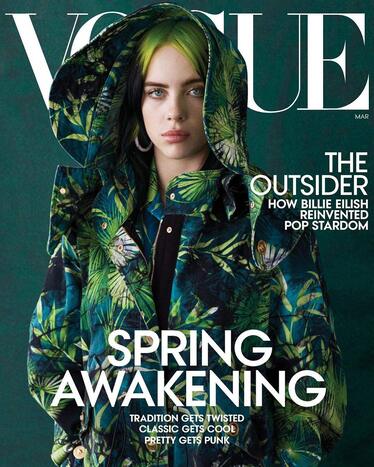
This was the main Image I used as inspiration for my table of contents. As my magazine was called "Discography,"I thought having Tyler, The Creator's discography in the format as the number one charts are on the left of their contents page would be a great idea.
Critical Reflection: Q5
2/25/2021
Discuss the ways in which the candidates’(this is you) own experiences of media consumption (how you use, access, and produce) illustrate wider patterns and trends in audience behaviour.
With the use of social media anything can go viral and be seen by millions of people just over night. Specifically, with music media, the app TikTok has a huge impact on the billboard charts and which songs are popular in any given moment. I am an active user of the app and have seen this occur many times. One new trend being done to a specific song then turns into the millions of users on that app associating the trend with the song and promoting it without even knowing. This then leads to other audiences to be interested in the music, which in turn is a free promotion in itself for the song and artist. Even if the app users don’t like the song or don’t want to search up the full version, they still participate in the trend which gives the music more exposure. The virality of the trend goes hand in hand with the song played in the background which serves as a chain reaction to other users to do the trend with the same song.
With the use of social media anything can go viral and be seen by millions of people just over night. Specifically, with music media, the app TikTok has a huge impact on the billboard charts and which songs are popular in any given moment. I am an active user of the app and have seen this occur many times. One new trend being done to a specific song then turns into the millions of users on that app associating the trend with the song and promoting it without even knowing. This then leads to other audiences to be interested in the music, which in turn is a free promotion in itself for the song and artist. Even if the app users don’t like the song or don’t want to search up the full version, they still participate in the trend which gives the music more exposure. The virality of the trend goes hand in hand with the song played in the background which serves as a chain reaction to other users to do the trend with the same song.
Mise-En-Scene: 5 Essential Elements
2/19/2021
- Setting: The setting gives an understanding and explanation for why and how the characters are acting a certain way.
- Décor: The décor of the scene can act as a form of expression to add to the tone and mood of the clip.
- Lighting: The lighting can sometimes give insight to the type of clip you are watching and let the audience know how to feel about the situation.
- Depth of space: Depth of space give the audience and idea of the surroundings and how the characters are set up in relation to other objects. It can help us feel what the characters are feeling in the moment.
- Costumes and makeup: The outfits and makeup used tells us about the characters themselves and gives an insight into their lives.
Magazine Cover Revision
2/19/2021
|
|
The cover on the left is the original one I submitted and the one on the right is the revision. I'm still not fully happy with it and find I quite boring. I wanted a minimalistic feel to the cover, although I have not executed it well. Especially since this is a music magazine. Music magazines are typically fun with eye catching features and this does not emulate that. Needs more work. I increased the size on the image because having it far away lost sight of who the main focus should be on. Also, the fade on the masthead had many gaps in in which is why I made it larger and more cohesive. I changed the strap-line from "only music for you" to "music only for you" because I felt it had a better ring to it. Moving "male solo" to the same line as "artist" made the cover look more balanced and centered.
Text Analysis Question
2/18/2021
What significance does the continuing development of digital media technology have for media institutions and audiences?
As technology progresses it gives us more opportunity to expand our creativity. New software being created means more options on how we can create a wide range of new work. This can also help people with a niche art style expand and leave their comfort zone to make something out of the ordinary. If media institutions are one of the first to get their hands on the new developments, they could become more popular for doing something that has never been done or seen before by consumers. Also, with developing technology, people minds are also being programed to constantly be on the lookout for something new or improved that catches their attention.
As technology progresses it gives us more opportunity to expand our creativity. New software being created means more options on how we can create a wide range of new work. This can also help people with a niche art style expand and leave their comfort zone to make something out of the ordinary. If media institutions are one of the first to get their hands on the new developments, they could become more popular for doing something that has never been done or seen before by consumers. Also, with developing technology, people minds are also being programed to constantly be on the lookout for something new or improved that catches their attention.
Critical Reflection: Q4- draft
2/17/2021
4. How did you integrate technologies – software, hardware and online – in this project?
In the creation of my magazine, many technologies were integrated. All the photos in the magazine were taken on the camera app of an IPhone 10 which were then transferred onto my computer in order to be added in to the layouts I created. These layouts were all made from scratch on Photopea with inspiration from websites and other outlets. Other software’s that were used to create my magazine were writing apps such as Microsoft Word and Grammarly in order to spell check and create a well written article for my two-page spread. I also used a flash drive in order to keep all the elements to the magazine in one place to stay organized. Lastly, I have a monitor that connects to my computer to create a second screen to work on layouts. This is helpful because I can work on the layout on one screen and have my inspiration on the other.
In the creation of my magazine, many technologies were integrated. All the photos in the magazine were taken on the camera app of an IPhone 10 which were then transferred onto my computer in order to be added in to the layouts I created. These layouts were all made from scratch on Photopea with inspiration from websites and other outlets. Other software’s that were used to create my magazine were writing apps such as Microsoft Word and Grammarly in order to spell check and create a well written article for my two-page spread. I also used a flash drive in order to keep all the elements to the magazine in one place to stay organized. Lastly, I have a monitor that connects to my computer to create a second screen to work on layouts. This is helpful because I can work on the layout on one screen and have my inspiration on the other.
First Double-Page-Spread
2/16/2021

This was the final first draft of my double page spread. There are many typos and technical issues that needed to be fixed in my final copy of the spread. In general I am very please with how it turned out and proud of myself for being able to make it. The entire article was written in Microsoft Word first and the copied into the layout in parts.
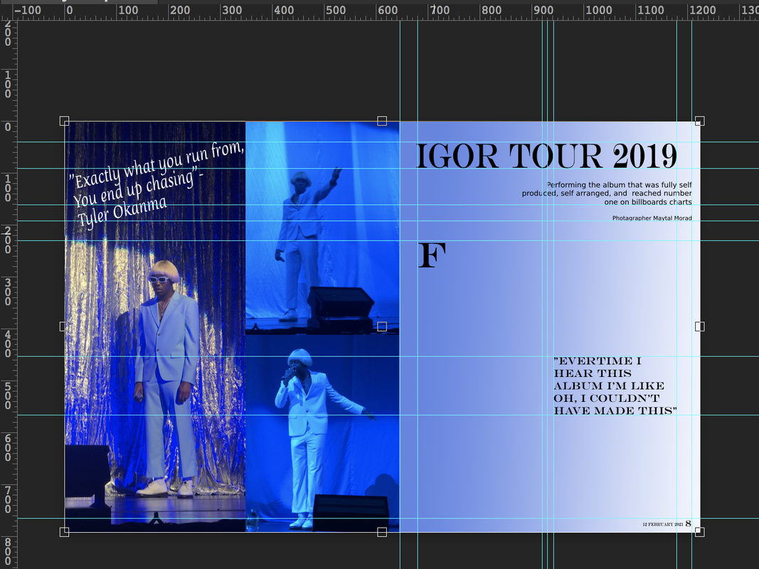
This was my first few times working on the double page spread. First, I started on the left side with the three images. There were many to choose from, but I decided to stick to one color palette to make it more pleasing to the eye. Having a blue color pallet here also compliments the pink image on the cover of the magazine with the blue text. After I got the images set in place by using the guides and ruler feature to find the center, I picked the color for the gradient on the right. There is a gradient feature that helped me do this and I clicked and dragged the color until I was satisfied with the look. This was also my second time making this spread because the first time PhotoPea crashed on my computer and I forgot to save my work every so often. Thankfully not much was done when I lost my work, but I did not make this mistake again.
I used this example to help me figure out the best way to insert my quote into the article.
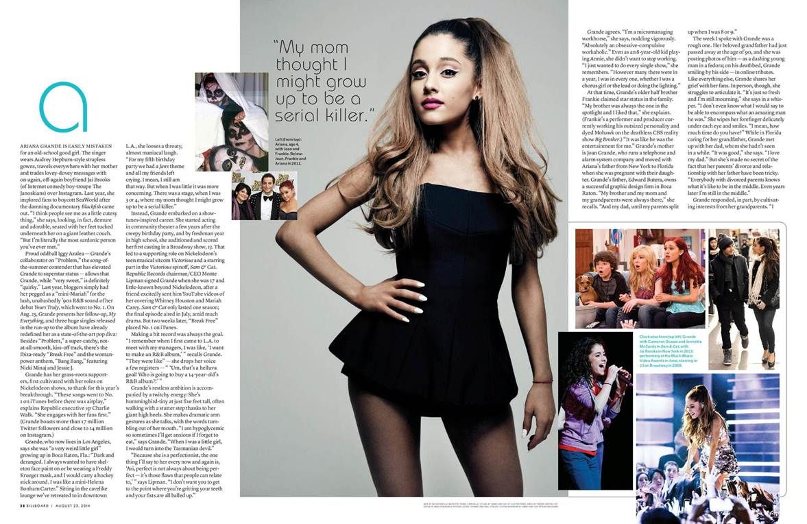
These are two more photos that I used for inspiration to based my spread on. I found these by searching for "music magazine double page spread."
Ways Editing Impacts a Film
1/27/2021
- They are able to shift the films perspective which can change the way the film is seen or interpreted.
- The way they cut together the film aids in telling the story and invoking the desired emotion. This contributes to the emotional narrative of the story as well.
- Editors need to ensure each cut advances the story rather than bogging it down
Critical Reflection: Q3- draft
1/25/2021
3. How did your production skills develop throughout this project? Explain research, using different applications, layout and design of your magazine or video.
Through the process of creating my magazine, my skills in Photoshop and creativity increased immensely. Since we had creative freedom on the topic of our magazines, I was able to pick something that I am passionate about and makes me happy. That the positive energy was then being translated into working harder to understand Photoshop programs and other helpful websites to create the magazine. Prior to this project, I was very familiar with the program InDesign which is fairly similar to Photoshop and other websites such as Photopea. However, working more frequently with these new programs helped me increase my knowledge of different tools and features I could use. Although I wasn’t familiar with some other production websites, such as Canva, my skills developed and I am now sufficient with working with those resources as well.
Through the process of creating my magazine, my skills in Photoshop and creativity increased immensely. Since we had creative freedom on the topic of our magazines, I was able to pick something that I am passionate about and makes me happy. That the positive energy was then being translated into working harder to understand Photoshop programs and other helpful websites to create the magazine. Prior to this project, I was very familiar with the program InDesign which is fairly similar to Photoshop and other websites such as Photopea. However, working more frequently with these new programs helped me increase my knowledge of different tools and features I could use. Although I wasn’t familiar with some other production websites, such as Canva, my skills developed and I am now sufficient with working with those resources as well.
Critical Reflection: Q2- draft
1/25/2021
2. How does your product engage with audiences and how would it be distributed as a real media text?
My magazine engages with audiences in many ways because it’s made in collaboration with the artist for their supports and other potential consumers. This gives the artist a chance to engage with their audience more directly as the consumer is getting a more detailed look at the artists thought processes behind their music. Also, majority of magazine companies have a focus in pop culture, while this one specifically targets the music industry which isn’t seen very often. For this reason, I named the magazine “Discography” because it surrounds the artist’s and their music. Also, since the artists are given creative freedom to create their own articles, they typically find ways to have exclusive opportunities to engage with their audience directly through the magazine.
As a real media text, my product is to be distributed both through print and media. Traditionally magazines are mostly distributed through print, although as we move further into the great age of technology, it is vital to have digital options available as well. This digital option with be in the form of a document identical to the original print versions. They can be bought online through the website directly or other second-hand vendors. The print versions of the magazines will be able to be found in local book and grocery stores.
Sopranos Write-Up (Sound only)
1/25/2021
This clip from the Sopranos opens up with the theme song music which is considered diegetic noise. This is put here to create an association with the song to the show. Followed by that, the clip had silence for a couple minutes while the camera was panning around. The silence shows the in-depth thoughts the man is going through prior to the psychiatrist appointment. When the psychiatrist comes out to get him for the appointment, the synchronous sound of the door opening is played to let the audience know we are about to be introduce to a new character. In this first set of dialogue between the psychiatrist and the man, we learn his last name is Soprano. They introduce him this way to help understand the professional setting the character is in. Also, once they were in the office together and the appointment began, there was more silence and the two characters sat there together quietly. This silence aids in the awkward and ominous tone that the scene is giving off all together. Through further dialogue we learn that the man has anxiety and there was a flashback picturing some experiences Mr. Soprano has had. The flashback opened up with incidental ominous music which acted as a sound bridge to the opening clip. This was implemented so the audience understands we are going back in time and this is a memory. Through this flashback there were other diegetic sounds which aided to the setting of the memory. These included ducks quacking and birds chirping in the backyard.
Critical Reflection: Q1- draft
1/21/2021
1. How does your product use or challenge conventions and how does it represent social groups or issues?
My product is a magazine that specifically surrounds music and the discography of a wide range of music artists. I used only a handful of magazines for inspiration and made each page without a template. For this reason, I believe I was able to step out of the ordinary and create something that hasn’t been seen very often in the magazine industry. Due to this there were also no restrictions in place when deciding my layouts. The masthead on my cover page is the most unconventional because of the fading of the title. Also, most models on magazine covers have strong eye contact, while mine is in a live concert preforming in an unprofessional setting.
As well as being unconventional, my magazine is inclusive and represents social groups and other issues. When creating each issue for the magazine we cover anywhere from well-known, to up and coming artists. We collaborate with them to curate the magazine of their dreams in our template. They are given lots of creative freedom and encouraged include some of their own articles as well. These articles are typically included towards the end of the magazine and the artist are able to promote whatever causes or social issues they stand by or want to bring awareness to. Also, in each issue there are hot topics that are briefly discussed on certain pages. We have no restrictions or limitations on what artist can be featured for our issues which is why there is such diversity in our magazines themselves.
Understanding Purchased Media Ownership
1/15/2021
The definition of purchased media ownership should be exactly what it sounds like. When someone is going to purchase a piece of media they should be paying for the right to own, sell, and display the media with no issues. There should also be no reason for the original distributer to call back on the media or remove it from your possession without a full refund since the person rightfully bought it from the copyright holder. In this case such as the Amazon class action suit, it is wrong and misleading for them to have the power to remove the media from your digital library after one has already purchased the media under the “buy” button of the website. In cases like a Netflix subscription it is different because the consumers are buying for the right to use the media Netflix holds, whereas for Amazon the consumers, they are led to think they are buying the media for fair use.
Downloadable media content ownership all depends on the way you are purchasing the media. For example, if you are buying a digital download of an album from an artist you should be able to keep, sell and redistribute it, although if you are purchasing a subscription in which they are providing the music and services for you, they should be allowed to remove any media without an issue. This whole discussion is based on how purchased media ownership is defined and the misleading information companies put out that make the consumers think they have full ownership when in reality they do not. In my opinion as a consumer, I think downloadable media content ownership that I’m buying directly, not through a subscription, should be my own.
Downloadable media content ownership all depends on the way you are purchasing the media. For example, if you are buying a digital download of an album from an artist you should be able to keep, sell and redistribute it, although if you are purchasing a subscription in which they are providing the music and services for you, they should be allowed to remove any media without an issue. This whole discussion is based on how purchased media ownership is defined and the misleading information companies put out that make the consumers think they have full ownership when in reality they do not. In my opinion as a consumer, I think downloadable media content ownership that I’m buying directly, not through a subscription, should be my own.
Practice Response Video: Sopranos (Notes only)
1/15/2021
Video Clip Notes
Camera Work:
Sound:
Mise-en-scene:
Editing:
Meaning
Here we are seeing a man that cannot come to terms with his anxiety. In the real-world men aren’t typically in tune with their emotions and this is an example of that. He is at the psychiatrist office to receive help.
Camera Work:
- Intro includes multiple short takes to tell the theme of show.
- Establishes shot with wide angle of the guy in the house (location)
- Close up of statue in front of the man (see what he’s looking at)
- Zoom in of both the guy and the statue (deep in though)
- mid shot of the woman calling his name
- wide shot of them standing in the room
- flashback of the house is a wide angel
- close up of his eye blinking followed by an aerial view of him lying in bed (shoes he’s awake and struggling to sleep)
- Mid shots of them speaking
- Wide shot of him walking in his lawn in the flashback
- Wide shot of him getting in the pool with robe on still throwing bread (trying to get ducks in pool with him)
- Close up of daughter’s friend looking out the window (she doesn’t look confused which shows she’s used to the strange behavior he displays)
- Three-shot of wife daughter and friend
- Wide shot of all of them going out side
Sound:
- Theme song music (diegetic)
- Door opening (synchronous)
- First set of dialogue we learn the last name of the man
- Silence between the two characters to set an awkward tone
- Through dialogue we learn he has anxiety
- Ominous music opens up the flashback clip (incidental) (sound bridge to next opening clip)
- Birds chirping in the back (diegetic)
- Ducks quacking (diegetic)
- Him laughing while ducks are around (the make him happy)
- Tells the psychiatrist the ducks are his “friends”
Mise-en-scene:
- neutral comforting colors (color design)
- All costumes are casual and sleek to show they are in a formal setting (costume)
- Set in a psychiatrist office (set design)
- In the flashback, it follows the man’s neighborhood (location)
- Picks up newspaper from driveway (Prop)
- The ducks are brown which add to the neutral color pallet
- Inside the house is very classic and the back yard looks like they are rich (set design)
- Characters have accent (maybe from New Jersey)
Editing:
- Used continuity system
- Eye line match of the man and the statue
- Shot reverse shot of the man and the therapist to foreshadow dialogue
- Flashback of the day of the incident
- Returns to shot reverse shot of them speaking
- Eye line match of the ducks and the man
- Action shot of daughter’s friend walking from the window to the kitchen
Meaning
Here we are seeing a man that cannot come to terms with his anxiety. In the real-world men aren’t typically in tune with their emotions and this is an example of that. He is at the psychiatrist office to receive help.
Midterm Exam- Part 2
Analyze how media institutions are using different platforms to engage with their audiences.
The music industry is one that consists of both companies and independent artists that create a profit based on releasing songs as an art form. This leads to gaining a higher audience for which they can create live shows, video recordings, and other compositions. In return, while working with their audience, they gain revenue with our engagement with their productions. Rather than a company prompting an item, in the music industry, the bands or artists are promoting themselves and their work for support in return. This support from their audiences turns into a form of profit for the creators in ways the audience typically wouldn’t realize.
The music industry is a very complex form and there are multiple routes one can take to engage with their audience. Music is a distinct form of media that can be found and distributed through so many different outlets that the companies or artists need to pinpoint where their audience is and how to best reach them. these outlets consist of the new untraditional ways and the basic well-known routes as well. Some of the newer outlets include YouTube Music, Apple Music, Sound Cloud, and Spotify, while more traditional ones would be radio promotions, CDs, or vinyl’s. This places a new competition for user attention on the different platforms onto the creators. By doing this the creators are needing to find new ways to engage with their existing audience and entice new fans to support them. With the growing outlets and opportunity to find and engage with a new audience, the creators use this as a way for making more creative music, productions, or other things that haven’t been done before. It has been seen that audiences enjoy more interactive and immersive experiences which is another way the creators themselves engage with their audience through their media form of music.
Besides the growing age of technology, the outlets and platforms used for music distribution are constantly growing to adapt to the changing society. This can become an issue when promoting to both local and global audiences. This is because some societies progress faster than others which is why you need to constantly be prevalent on every outlet you can engage an audience on. For example, an artist can take a single song they create and upload it to multiple different platforms while still promoting it on apps that aren’t relevant to music. For instance, if an artist was to put out a song on Apple Music, they could go onto Instagram where they have a lot of engagement and their target audience to promote their new song and tell people to stream it. By doing this as well, the audience can repost and say their opinions which benefits the artist by having their audience reach new people too. In situations like this, musicians are very reliant on their audience so it’s important for them to promote and stand for the right ideas themselves because they aren’t only selling their music, they are selling themselves as the creator.
It has been shown that marketers that use videos as a form of engagement see revenue growth 49% faster than those who don’t. In the case of music as media, the revenue is a sign of the institutions using different platforms for engagement because it shows they are using every available option to reach the people to their advantage. If an artist were to have Twitter as their main platform to reach their target audience, they could also branch out to others such as YouTube. On YouTube engagement can be met by putting advertisements for your discography on a different video, or you can simply create your own videos as something on the side to have a good connection with your audience. As being a part of multiple audiences and target groups myself, I have been most interested when the artist I like is on multiple different platforms because it makes it feel like there is less of a barrier between us as people in the social class. It feels better to support a creator that doesn’t see themselves as an untouchable being that is doing the audience a favor, but rather when they see themselves as equal and that they could be one with their supporters.
Technology has played a very important in the spread and engagement of media. Now more than ever, there are tons of ways that institutions, companies, and individual artists in the music industry can use to engage with their audiences. They need to be up to date with the new technological convergences so they are able to stay relevant and have their contributions to the industry stay important. This is also key when there is the involvement of both a local and global audience since they will be using different platforms in different areas.
Midterm Exam- Part 1
12/18/2020
Notes
Camera Work:
Sound:
Mise-en-scene:
Editing:
Evaluation
In this video clip, under each category, multiple techniques were used. To begin with, regarding camera work, the opening scene was an establishing shot that showed the whole horizon of the city from across a body of water. This also sets the location for the film opening by showing that it’s going to take place in a city where there are lots of tall buildings and bright lights at night. Throughout the whole video, there were mostly mid shots used, however, there was also a lot of movement used in every shot. This was done so that early on the audience can understand the setting the characters are in. After the main character was shown from a few shots, there was a wide track shot of two characters, Wes and Kelly. They were going towards the club the main character was leading which shows they will be significant later since they were showcased early on. An over the shoulder shot was also used to display the characters going into the club. As the main character Yorkie approaches the doors with a close-up shot, the audience can see that she is contemplating whether to go in or not. As she enters, there was a mid-shot of her from behind which leads to a movement shot of the whole club to set the location. After the location was established and the audience understood the layout of the set design, there was a mid-shot of a new character foreshadowed that he would come up later in the clip. This is also established because, after that, it moved to a two-shot scene of him approaching her in the arcade. Later, there is a mid-shot of the character from earlier, Wes, and it seems that he is looking around for something or someone. Directly after that, there was a close-up shot of Kelly looking distressed and turning around which show us that Wes was looking for Kelly. Once Wes got eyes on Kelly, there was a three-shot of him speaking and walking away from Kelly and Yorkie on the couch.
There were also different sounds added into the opening which were used for setting the tone. For example, the incidental sound was used in the form of ominous music which sound bridged into the first opening scene. This lets the audience know what kind of mood they are going to be put in from watching. Also, there were a lot of diegetic sounds put in that gave the audience the information needed to understand the extract. An example of this is lots of music and talking which shows this is placed in an area of some sort of club. Another example of diegetic sound giving the audience insight is that the radio in the first scene said, “biggest hits of 1987” which tells us what time period this was placed in. There was plenty of background noise in the form of talking, however, the first real dialogue was between Kelly and Wes before they walked into the club called “Tucker’s.” As Wes almost chases Kelly she says, “Could you please stop it I’m just trying to have some fun.” Due to this, we know that these characters are going to be important later on because they hold the first set of dialogue and that there is some sort of conflict between them. There was the use of synchronous sound made by the sound of the Pac Man game in the arcade of the club. In this room, a man approaches her, although through dialogue the audience can see she is not interested in speaking to anyone and is simply exploring the area. Throughout the extract, there were a lot of loud noises and music as sound effects to keep up with the location being a busy club on a night out in the town. Later on, when Kelly sits with the main character, she says “follow along with what I say” which shows she is trying to get of a situation with Wes. This is also when we learn the main character’s name is Yorkie since Kelly asks as Wes walks away. Following that, Kelly says “do I have to tug on your leash” which was a play on Yorkie’s name because she was seemingly uncomfortable and didn’t want to get up from her seat.
Like in every visual piece of media, the use of mise-en-scene was very prominent and important. This clip of the film was set in a single location, but the overall production design was dark lighting the whole time to set the mysterious, yet intriguing tone. Early on in the first clip, the audience found out this was set in the year 1987. Followed by this, the color design of the whole extract were vibrant colors displayed through and expressed in different ways. One way is through the vibrant makeup of all the characters; although, Yorkie had somewhat natural makeup which could allude to the fact that she may not belong in that time period. Also, all the costumes were bright colors and funky silhouettes went adds to the 80s-time period. As this whole extract was set outside and in the club, props such as drinks were used to keep the theme going. In addition, the set design was the whole club in which there was an upstairs and arcade in another room.
In addition, the mise-en-scene worked together with the editing to make a piece that flows well and gives the audience a good understanding of it. After the first opening short take shot of the horizon, there was an immediate jump cut to the rest of the extract. After the first jump cup, the continuity system was used, and the rest of the piece all flowed together to create one narrative. As Wes and Kelly were walking there was an eye-line match of Yorkie looking at them which shows she acknowledges them and that they may come up later in the extract. Shortly after, an action shot of them walking into the club was used to show Yorkie walking in the same direction as them. Once Yorkie made it into the club, there was a long shot of her which showed the whole layout of the set design. This gives the audience a whole idea of the location so we can understand the relation of the distance of characters and what part of the club they are in. Also, since the whole extract was only set in this one location, the audience needs to be familiar with it. Later, a shot-reverse-shot was used to show Kelly and Yorkie on the couch while Wes is talking to them. this type of editing is very popular when a dialogue is in action so that we can see both angles of the conversation.
With all of these tactics and technical elements, the extract from Black Mirror is able to construct the meaning of the piece. There were representations of the individuals through editing around the main character Yorkie. Groups were shown in the way of costumes being complementary as seen with Wes and Kelly and other background characters. Also, events were represented as the sounds included high amounts of background diegetic noises such as music and talking. This added to the setting which was in the club. Lastly, the places, the location, and set design were most notably shown through the camera work and the way the main long shot showed the whole area inside Tucker’s.
Camera Work:
- Establishes shot with wide angle of the horizon (location)
- Steady cam tilt shot starting from above to see the surrounding are
- Full body track shot following the main character (from the side
- mid body with track shot to get a better look of her face
- wide track shot of two more characters walking (Wes and Kelly) turns into mid shot as they get closer to cam
- over the shoulder shot Wes and Kelly going into tucker’s (a lot of movement was used in every shot)
- close of main character going into the club (shows decision making)
- mid shot from behind of her (changes to movement without her in the shot) in the club so you can see what’s going on
- Mid shot of a new character (shows he will be significant later), moves to two-shot of him approaching her
- Mid shot of Wes looking around- Close up when Kelly sees the Wes looking for her (looks distressed)
- Three-shot of Wes walking away, Kelly and main character (Yorkie) on couch
Sound:
- Ominous music opens up the clip (incidental) (sound bridge to next opening clip)
- People yelling and talking (diegetic)
- “biggest hits of 1987” on the radio (diegetic)
- Kelly and Wes- (dialogue) “could you please stop it I’m just trying to have some fun” “Kelly stop it”
- Sound of the Pac man arcade game (synchronous)
- First guy tries to talk to her at the game and she basically ignores him
- Music and loud noises to show the club is busy (sound effects)
- “follow along with what I say” Kelly doesn’t want to speak with Wes
- Yorkie is the main characters name- says this while speaking to Kelly
- “do I have to tug your leash” a play on the name Yorkie
Mise-en-scene:
- Dark lighting the whole time to set the mysterious, yet cynical tone (production design)
- All costumes have bright colors showing the time period (costume)
- Set in the club
- At a club called Tucker’s
- Yorkie has natural makeup but everyone else has vibrant makeup
- Vibrant colors displayed throughout (color design)
- She was drinking a soda (prop)
- There was an arcade and an upstairs in the club (set design)
Editing:
- Used continuity system
- Start with short take of the horizon and immediately jump cuts into the rest
- Eye-line match of Yorkie walking and then Kelly and Wes walking
- Action shot of Kelly and Wes Walking in and Yorkie walking as well
- Long shot of Yorkie first walking around the club
- Shot reverse shot of Kelly and Yorkie on the couch while Wes is talking to them
Evaluation
In this video clip, under each category, multiple techniques were used. To begin with, regarding camera work, the opening scene was an establishing shot that showed the whole horizon of the city from across a body of water. This also sets the location for the film opening by showing that it’s going to take place in a city where there are lots of tall buildings and bright lights at night. Throughout the whole video, there were mostly mid shots used, however, there was also a lot of movement used in every shot. This was done so that early on the audience can understand the setting the characters are in. After the main character was shown from a few shots, there was a wide track shot of two characters, Wes and Kelly. They were going towards the club the main character was leading which shows they will be significant later since they were showcased early on. An over the shoulder shot was also used to display the characters going into the club. As the main character Yorkie approaches the doors with a close-up shot, the audience can see that she is contemplating whether to go in or not. As she enters, there was a mid-shot of her from behind which leads to a movement shot of the whole club to set the location. After the location was established and the audience understood the layout of the set design, there was a mid-shot of a new character foreshadowed that he would come up later in the clip. This is also established because, after that, it moved to a two-shot scene of him approaching her in the arcade. Later, there is a mid-shot of the character from earlier, Wes, and it seems that he is looking around for something or someone. Directly after that, there was a close-up shot of Kelly looking distressed and turning around which show us that Wes was looking for Kelly. Once Wes got eyes on Kelly, there was a three-shot of him speaking and walking away from Kelly and Yorkie on the couch.
There were also different sounds added into the opening which were used for setting the tone. For example, the incidental sound was used in the form of ominous music which sound bridged into the first opening scene. This lets the audience know what kind of mood they are going to be put in from watching. Also, there were a lot of diegetic sounds put in that gave the audience the information needed to understand the extract. An example of this is lots of music and talking which shows this is placed in an area of some sort of club. Another example of diegetic sound giving the audience insight is that the radio in the first scene said, “biggest hits of 1987” which tells us what time period this was placed in. There was plenty of background noise in the form of talking, however, the first real dialogue was between Kelly and Wes before they walked into the club called “Tucker’s.” As Wes almost chases Kelly she says, “Could you please stop it I’m just trying to have some fun.” Due to this, we know that these characters are going to be important later on because they hold the first set of dialogue and that there is some sort of conflict between them. There was the use of synchronous sound made by the sound of the Pac Man game in the arcade of the club. In this room, a man approaches her, although through dialogue the audience can see she is not interested in speaking to anyone and is simply exploring the area. Throughout the extract, there were a lot of loud noises and music as sound effects to keep up with the location being a busy club on a night out in the town. Later on, when Kelly sits with the main character, she says “follow along with what I say” which shows she is trying to get of a situation with Wes. This is also when we learn the main character’s name is Yorkie since Kelly asks as Wes walks away. Following that, Kelly says “do I have to tug on your leash” which was a play on Yorkie’s name because she was seemingly uncomfortable and didn’t want to get up from her seat.
Like in every visual piece of media, the use of mise-en-scene was very prominent and important. This clip of the film was set in a single location, but the overall production design was dark lighting the whole time to set the mysterious, yet intriguing tone. Early on in the first clip, the audience found out this was set in the year 1987. Followed by this, the color design of the whole extract were vibrant colors displayed through and expressed in different ways. One way is through the vibrant makeup of all the characters; although, Yorkie had somewhat natural makeup which could allude to the fact that she may not belong in that time period. Also, all the costumes were bright colors and funky silhouettes went adds to the 80s-time period. As this whole extract was set outside and in the club, props such as drinks were used to keep the theme going. In addition, the set design was the whole club in which there was an upstairs and arcade in another room.
In addition, the mise-en-scene worked together with the editing to make a piece that flows well and gives the audience a good understanding of it. After the first opening short take shot of the horizon, there was an immediate jump cut to the rest of the extract. After the first jump cup, the continuity system was used, and the rest of the piece all flowed together to create one narrative. As Wes and Kelly were walking there was an eye-line match of Yorkie looking at them which shows she acknowledges them and that they may come up later in the extract. Shortly after, an action shot of them walking into the club was used to show Yorkie walking in the same direction as them. Once Yorkie made it into the club, there was a long shot of her which showed the whole layout of the set design. This gives the audience a whole idea of the location so we can understand the relation of the distance of characters and what part of the club they are in. Also, since the whole extract was only set in this one location, the audience needs to be familiar with it. Later, a shot-reverse-shot was used to show Kelly and Yorkie on the couch while Wes is talking to them. this type of editing is very popular when a dialogue is in action so that we can see both angles of the conversation.
With all of these tactics and technical elements, the extract from Black Mirror is able to construct the meaning of the piece. There were representations of the individuals through editing around the main character Yorkie. Groups were shown in the way of costumes being complementary as seen with Wes and Kelly and other background characters. Also, events were represented as the sounds included high amounts of background diegetic noises such as music and talking. This added to the setting which was in the club. Lastly, the places, the location, and set design were most notably shown through the camera work and the way the main long shot showed the whole area inside Tucker’s.
Media Context
12/4/2020
Issues raised by media ownership
Today in our new world all media companies are owned by large conglomerates, also known as parent companies. The major ones include The Walt Disney Company, Viacom, Comcast, News Corp, CBS, and Time Warner. By 2011 all of these major conglomerates own 90% of all US media. Each of the company’s own smaller ones that keep trickling down into a chain of brands that are ultimately all run by one singular conglomerate.
Companies are structured in one of two ways in their conglomerate. The first one being vertical which shows the companies that depend on each other. The other way is horizontal and that gives a visual of companies owned by the same parent company but do not rely on each other. These representations help us better understand where censorship or freedom is given. Vertical integrations are typically more seen within newscasts because the parent company can own the broadcast system, distributor, and production team. With that, they are reducing expenses and paying themselves to do the work since it’s all brought back to a singular conglomerate.
There are also different ways the corporations will work together with their smaller chains to run all media. These tactics are known as synergy and include cross-promotion, cross- production, and cross-advertising. In a cross-promotion, the parent company will promote its own stations their own media outlets. This gives free advertising for themselves and they get to control what the viewers see. Cross-production is when the conglomerate takes a single product and produces it in several forms. Due to that, the capitalism of these conglomerates is strengthened because it entices the audience to continue to purchase and view their products. Lastly, in cross-advertising, an outside company will promote through a different conglomerate to gain more recognition. All of these tactics have large influences on the workers, viewers, and the other conglomerates as well.
Some major workers in the industry of the large corporations are seen to be extremely successful and have ranged in their portfolios, although with a closer look anyone can spot out that all of their work was done for a singular parent company. For example, Miley Cyrus is a popular musician and actress, however, all of her movies, shows, and music production companies are owned by the Walt Disney conglomerate. This makes diversity levels go down and has the viewers limited based on what the parent company wants us to consume. Conglomerates own a variety of companies so they are in full control of all media let out by them. With that, audiences are more vulnerable and susceptible to falling into a trap for misinformation since they are being told the same thing from what seems to be multiple different companies. Although, the big picture is that all these companies are the same if they’re under a singular conglomerate. In this case, political influences are the most common example due to the way they control all systems in their vertical integration. Also, as we move into the greater age of technology, it becomes easier for the conglomerates to limit what we view and the way we discuss certain topics. Other issues raised by media ownership include the decrease in the stock values of the parent company due to the smaller individual companies growing higher.
Case studies have been done on the conglomerates and show how they start from a small individual company into large corporations. An example of this is that the brand Colgate was bought by a larger company named Palmolive in which they created a joint company. Together they bought out multiple other businesses such as Riviana, Softsoap, and Suavitel which all led to their $15.5 billion-dollar net worth at the end of 2018. If the individual companies of Colgate and Palmolive had not joined together, they would have seen a decrease in sales while fighting against other larger companies.
First TOC
12/6/20
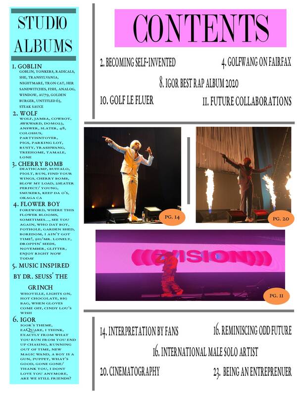
Similar to my magazine's cover, I did not use a template for the table of contents. I used one of the Billboards magazine for inspiration and tried to create my own from that.
- My TOC challenges normal conventions since it intent very representative of the articles, but more so the albums and photos. Since this magazine surrounds Tyler, the Creator and his discography, it was very important for me to add his albums and songs somewhere large. also I believe the photos are representative of the articles and can make the audience more likely to read the articles that have a picture. My magazine represents the group of that support Tyler and his music and other artists he has collaborated with/ associates himself with.
- My table of contents appeals to my target audience because it's very representative of the main theme which is Tyler, the Creator and his music career. My sister said I should find a way the layout the middle of the cover better . I agree with this. Since I didn't use a template I went with whatever idea I made up, but I know there is definitely still a lot of room for improvement. My magazine could be distributed both digitally and physically on paper.
TOC Layout Inspiration
10/30/2020
I like this table of contents because it includes a lot of colors with the white background which would be a contrast to my cover page that is color contrasted with white.
This example actually inspired me to write "Discography," the name of my magazine, in large bold letters and try to overlay an image within the letters. I would then include the contents surrounding that main focal point. Logistically this may not work, but it is a good starting point for my idea.
With this sample, I enjoyed how minimalistic and clean the look is. If I were to choose this as my template I would definitely add more color to keep the playful mood of the magazine and maybe even try to find a way to include pictures
Potential Article Topics
10/30/2020
Since the whole idea of my magazine is surrounding Tyler, The Creator and music in general, the articles should definitely reflect that. Since I have already included "IGOR- Best Rap Album 2020" and "International Male Solo Artist" on the cover as teasers, these will be some of the first article titles in the table of contents. Other article titles/topics will be about certain music collaborations the artist has done and even articles about similar musicians will be included.
- IGOR- Best Rap Album 2020
- International Male Solo Artist
- Cinematography in Music videos
- GOLF WANG on Fairfax
- Tyler on collaboration with Billie Eilish
Comparative Response: Fargo
10/23/20
Notes
Camera Work:
In the film opening of Fargo, under each category multiple techniques were used. To begin with in regard to camera work, the opening scene was an established shot which showed the upstairs part of the house with only the wife in it. This also sets the location for the film opening by showing that it’s going to take place in different parts of their home. Later, when the location was moved to the basement, there was a wide shot to give the audience a reference of the space the couple was in. Over the shoulder shots were used when they were in conversation together which gave emphasis that they were the only ones in the room and speaking to each other. Also, a very notable part of the camera work was when there was a close up shot of the washing machine soon after the wife entered the basement. This foreshadowed to the audience that it might be the reason for conflict later in the scene.
There were also different sounds added into the opening which were definitely used for emphasis. For example, when the wife was still upstairs in the house there was use of diegetic sound by adding in tools rattling, insinuating another person is fixing something in the house. Also, after the wife turned on the machine to see if Lester had fixed it, it was rattling and making noises which let the audience know it actually got worse. After Lester got mad he yelled and hit the machine which showed he was mad and every time he hit his wife with the hammer a loud thud was added to show how hard he was actually hitting her. Later, when Lester ran upstairs and he was calling someone, synchronous sound was used for the dialing of numbers and the phone line ringing so the audience doesn’t get confused as to why he has the phone.
Like in every visual piece of media, the use of mise-en-scene was very prominent and important. The production design was set in a dark house with no open windows or major lights on, only lamps. This helped set the mysterious tone, along with the color design only being muted and neutral colors. Also, part of Lester’s costume was having dark under eye bags with makeup and a Band-Aid on his nose. This shows Lester was working very hard on fixing the machine and was somewhat stressed out or not in a good head space. Something very important for the set in the basement was the poster that said, “what if your right and they’re wrong” with orange goldfish and only one red fish. This poster had a close up shot while Lester was hitting his wife insinuating he was the odd red fish and she was the average orange fish that didn’t believe in him like everyone else.
In addition, the mise-en-scene worked together with the editing to make a piece that flows well and gives the audience a good understanding of it. When Lester and his wife were arguing, there was and eyeline shot of Lester and the hammer. This foreshadows to the audience that Lester is planning on using it in his head. Multiple action shots were used only in this one part of the opening. These are used to show multiple angles of one continuous action occurring. One was used when Lester was putting all of his clothes and the evidence in the trash bag after killing his wife, when he was on the phone they filmed this from multiple angels with the action shot, and when Lester was practicing how he would approach the person who assumingly will come in the next scenes. After Lester was on the phone, there was a short take of him putting bullets in the gun, which leave the audience apprehensive and up to imagining what will come next in the show.
Camera Work:
- Establishes shot by only showing the wife at first upstairs in the house (location)
- Wide shot of full basement to show the scene and what’s going on
- Two-shot of them watching the machine fail
- Over the shoulder view to emphasis they are the only ones in the room and in conversation
- Close up on washing machine (prop) to foreshadow this will be the reason for conflict later
- Close up shot of the hammer (prop) before Lester picks it up
- Mid-Shots used for most of their argument
- No long shots were used
- Shot of only her legs jumping every time he hit her
- POV shot of him looking at her dead body
- Ariel shot of her on the floor with him walking away
- Tools cranking to show Lester is working on the washing machine (diegetic)
- “Sure you know what you’re doing?” dialogue shows wife doesn’t believe in Lester
- machine rattling and making noises insinuating the machine wasn’t fixed after Lester tried
- Lester yells and hits the machine when he gets mad in argument
- Added loud thud every time he hit her with hammer
- Ominous music after he hit her the first time (incidental)
- Synchronous sound on dialing numbers on phone and the phone ringing
- Voice of person on other side on the phone call (diegetic)
- Knock on door at the end
- Dark lighting the whole time to set the mysterious tone (production design)
- Smoke coming out of the washing machine to show Lester made it worse
- Distance in the characters position while they speak to each other shows the distance in their relationship as well
- Band-Aid on Lester’s nose- he was hurt while attempting to fix the machine, worked hard (costume)
- Lester has really dark under eye bags (makeup)
- Muted color palette, no vibrant colors shown (color design)
- “what if you’re right and they’re wrong” poster, gets blood on it, one red fish the rest are orange
- fake blood
- Shot reverse shot of Lester and his wife arguing
- Eyeline shot of Lester and the hammer after
- Action match of him putting all the evidence in a trash bag
- Action match of Lester on the phone
- Short take of him putting bullets in the gun
- Action match of him opening and closing the door and pointing the gun
In the film opening of Fargo, under each category multiple techniques were used. To begin with in regard to camera work, the opening scene was an established shot which showed the upstairs part of the house with only the wife in it. This also sets the location for the film opening by showing that it’s going to take place in different parts of their home. Later, when the location was moved to the basement, there was a wide shot to give the audience a reference of the space the couple was in. Over the shoulder shots were used when they were in conversation together which gave emphasis that they were the only ones in the room and speaking to each other. Also, a very notable part of the camera work was when there was a close up shot of the washing machine soon after the wife entered the basement. This foreshadowed to the audience that it might be the reason for conflict later in the scene.
There were also different sounds added into the opening which were definitely used for emphasis. For example, when the wife was still upstairs in the house there was use of diegetic sound by adding in tools rattling, insinuating another person is fixing something in the house. Also, after the wife turned on the machine to see if Lester had fixed it, it was rattling and making noises which let the audience know it actually got worse. After Lester got mad he yelled and hit the machine which showed he was mad and every time he hit his wife with the hammer a loud thud was added to show how hard he was actually hitting her. Later, when Lester ran upstairs and he was calling someone, synchronous sound was used for the dialing of numbers and the phone line ringing so the audience doesn’t get confused as to why he has the phone.
Like in every visual piece of media, the use of mise-en-scene was very prominent and important. The production design was set in a dark house with no open windows or major lights on, only lamps. This helped set the mysterious tone, along with the color design only being muted and neutral colors. Also, part of Lester’s costume was having dark under eye bags with makeup and a Band-Aid on his nose. This shows Lester was working very hard on fixing the machine and was somewhat stressed out or not in a good head space. Something very important for the set in the basement was the poster that said, “what if your right and they’re wrong” with orange goldfish and only one red fish. This poster had a close up shot while Lester was hitting his wife insinuating he was the odd red fish and she was the average orange fish that didn’t believe in him like everyone else.
In addition, the mise-en-scene worked together with the editing to make a piece that flows well and gives the audience a good understanding of it. When Lester and his wife were arguing, there was and eyeline shot of Lester and the hammer. This foreshadows to the audience that Lester is planning on using it in his head. Multiple action shots were used only in this one part of the opening. These are used to show multiple angles of one continuous action occurring. One was used when Lester was putting all of his clothes and the evidence in the trash bag after killing his wife, when he was on the phone they filmed this from multiple angels with the action shot, and when Lester was practicing how he would approach the person who assumingly will come in the next scenes. After Lester was on the phone, there was a short take of him putting bullets in the gun, which leave the audience apprehensive and up to imagining what will come next in the show.
First Mockup Cover
10/20/2020
1. For the name of my magazine I decided to go with “Discography.” I chose this name because the magazine is going to be all about the music an artist creates, their history in the industry, and other important details from their career. This is why I placed the title as the masthead since I want the eye to be drawn to that first so the audience knows the premise of the articles. Also, in the top right I added another banner/subtitle that says “Tyler, The Creator” because he is the artist that is going to be focused on in this particular issue. I created this first mockup without using a template and I looked at a few minimalistic Vogue covers for inspiration. Again, since this issue is all about Tyler, The Creator, I wanted to make sure that the cover really represented this, so I tried to keep the photo as dominant as possible without letting the article teasers get in the way. Also, since the cover imagine is so colorful and bright I only wanted to use white lettering since it contrasts well and to keep the imagine in key focus. Since this is only the first mock up, the titles of the articles will most likely change and I will add more but for right now I’m enjoying the direction the cover is going in.
2. For the masthead I decided to make it look like the title was dragging out by adding two layers where each one decreased in opacity. From the beginning, I knew I wanted to do this since I thought it could make the whole project look a little more edgy and alternative. I didn’t feel any typical font was going to be able to achieve that vibe for me which is why I manually made 3 layers of the same text and put them over each other. As for the cover image, I have a couple other ones that I still might change it to, but for right know I like how this one looks the most. Since it has all the pink hues with Tyler being in the baby blue costume, it adds a playful effect to the fonts that typically look a little more serious and basic.
3. As I mentioned before since this is only the first mock up I still plan on experimenting with two other cover options that I have. For this cover in particular, it was taken from a down angel as Tyler is up in the air standing on a platform. From the bottom of the stage there were white and light blued LED lights shooting up at him which created a juxtaposition to the pink lights behind him which were focused on lighting up the back drop. Also, there was a projector in which Tyler’s face was being show in the back in live time, so there is a light shadow image of him there as well. This photo was taken on an IPhone X during a live concert that I was front row at. The concert was for Tyler, The Creator’s most recent album “IGOR” which is why he was dressed in that costume and in the middle of preforming. This addresses the reader by showing the persona he created for this era in his music career.
4. Right now I have placed the strapline some at the bottom of the cover under the main cover line since I want the reader’s attention to go towards the artist in this issue and not the magazine brand itself. I made it “music only for you” since the main premise of this magazine brand is going to be all about the featured artist of that month. This suggests to the reader that the magazine is basically a promotion for the artist. Clearly, since they are on the cover of a magazine it shows they are a public figure that is important in the eyes of the media. This is why readers would be more interested in checking out if they like their music or not. A rhetorical feature evident in the cover line is that it’s basically a mode of persuasion to get the audience interested in seeing that the artists on the cover has major awards for their industry. The most notable linguistic features on the cover is that the title article teasers are labeled as the different awards the artist has received so that it shows his success in the industry.
Picking a Cover Image
10/10/2020
Since my magazine topic is about an artist I already have photos of, I wanted to pick my cover photo before I created my first mock up of the magazine. I had many options to choose from, but I ended up narrowing it down to my top three options based on photo quality, clarity, and the overall ambiance that can be memorable to an audience. Although some of my other photo options didn't make the cut for the cover, they are being considered for the two page spread instead. All photos were taken by myself at a concert.
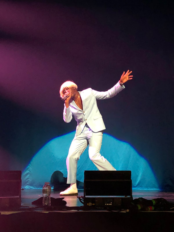
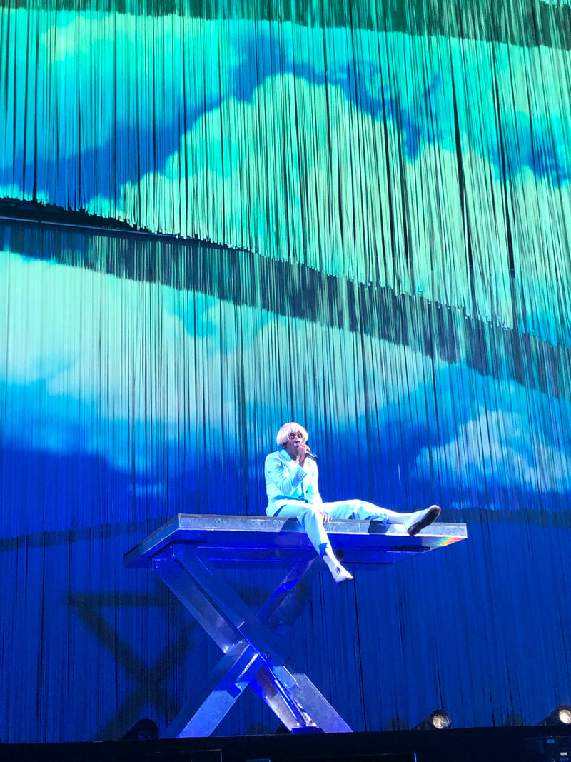
Intertextuality
9/28/2020
Intertextuality can be described as the way one piece of media references another, or the concept of borrowing from, modifying, and recycling other media to create a new form. This can be done either directly; when a reference is acknowledged and is shown to result from the choice of the producer, or indirectly; when something is shown to be a product of inspiration, yet not directly referencing another piece of media.
Types of Intertextuality
Examples of Intertextuality
Types of Intertextuality
- Obligatory- When the writer deliberately invokes a comparison or association between two or more texts.
- Accidental- This relies on the audience to make connections between two texts that were not intended by the author.
- Optional- The intent is to pay homage to the original writers and so the recognition of the allusion is not vital to the interpretation of the text.
Examples of Intertextuality
In the first example of intertextuality you can see the deliberate references from the movie "Mean Girls" in Ariana Grande's music video "Thank you, Next." After that, when looking at the show "Stranger Things," there are a number of references to multiple other different films. In this example, the movie "The shinning" was being referenced although it was more of an accidental type. On the other hand, for the last example Chris Brown was wearing the same costume as Micheal Jackson in his music video "She Ain't You" in order to pay a tribute to him which would be more of an optional type of intertextuality.
Semiotics
9/16/2020
Exercise: Look at a magazine cover. What can you tell about the type of magazine it is; what kinds of articles it contains; who is likely to read it? Why?
- Just from the cover, you can tell that this magazine is going to be about entertainment and music. This conclusion can be drawn since the model on the cover is Billie Eilish, a five time Grammy winner out of six nominations in the United States all in one year. Also, since Vogue, the company of the magazine, is established and well known, one can only assume that it would be about fashion and lifestyle as well. The articles this magazine contains are about how Billie Eilish was able to change "pop stardom" from something light and typical to a new more punk and alternative style type of vibe. The audience for this magazine is most likely Eilish's supporters and people who are intrigued about her incredibly quick rising fame. This is because people who aren't into pop culture or the modern rising stars of new generations are less inclined to reach for this type of magazine.
- Visual elements- The magazine cover has a base shade of green to compliment Eilish's neon green roots in her hair. Even the costume Eilish is wearing is made up of different shades of green to go along with the whole theme. All the wording is then written in white to contrast off of the green so that it is legible even with the words being behind her. This photo is a medium camera shot so that the audience can get an accurate representation of her more "punk" style.
- Linguistic elements – The title of the magazine is hidden behind the model since it is a well established company and does not need to steel the spotlight. The main teaser is written at the bottom of the cover fairly large which shows this is the main article and basis for what the magazine will entail.
- Representation – Eilish is placed front and center of this magazine cover to show that she is the main topic for that month's issue. The words are overlapping her costume, however they are not covering her in any major way.
- Mode of address – The particular audience is being addressed by having their favorite new star on the cover of this magazine. The teasers of the articles bring in attention to show how the audience can have a new positive and informative opportunity to learn more about their idol.
- Rhetoric – The potential readers are being persuaded to accept that Billie Eilish is changing the pop culture standard to a more alternative style. The magazine does this buy using key words such as "punk" and "reinvented" to show that this new change is inevitable with her increasing fame.